ข่าวที่ 1. Drift Light Packaging
ARTICLE (บทความ)
by Andrew T. Matthews
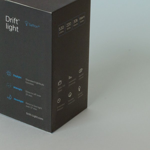
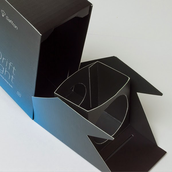
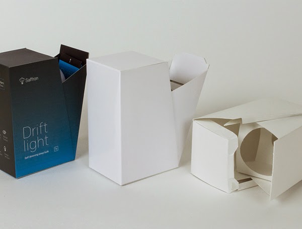
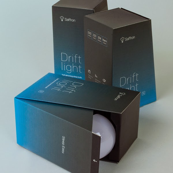
This is a custom packaging project for a micro-controlled "smart" bulb called the drift light. It's functionality is designed to mimic the color temperature and action of the average sunset. This helps create a natural sleep routine for adults and children. The LED bulb requires no app, and has three funtions: Daylight, which is standard lightbulb functionality, Moonlight, which dims slowly to a dim night-light, and Midnight, which is the mode that gradually fades to off.
The idea behind the packaging was to present the bulb in an accessible and unique way, while perpetuating a theme of calm and relaxed slumber. For more information on the drift light please
แปลข่าว
โดย แอนดรูว์ ต. แมทธิว
เป็นโครงการบรรจุภัณฑ์ที่กำหนดเองสำหรับไมโครควบคุมหลอดไฟที่เรียกว่า " สมาร์ท " แสงลอย เป็นฟังก์ชันที่ถูกออกแบบมาเพื่อเลียนแบบการกระทำของดวงอาทิตย์สีและอุณหภูมิเฉลี่ย
ช่วยสร้างขั้นตอนการนอนหลับธรรมชาติสำหรับเด็กและผู้ใหญ่ หลอดไฟ LED ไม่ต้องใช้ App และมี 3 ฟังก์ชัน : กลางวัน ซึ่งเป็นฟังก์ชันมาตรฐานหลอดไฟแสงจันทร์ที่ค่อยๆหรี่แสง กลางคืน มืด และ เที่ยงคืน ซึ่งเป็นโหมดที่ค่อยๆจางหายไป ความคิดที่อยู่เบื้องหลังบรรจุภัณฑ์ ปัจจุบันหลอดไฟในวิธีที่สามารถเข้าถึงได้และที่ไม่ซ้ำกันในขณะที่ฐาน ธีมของความสงบและนอนหลับสบายๆ สำหรับข้อมูลเพิ่มเติมเกี่ยวกับแสงลอยโปรด
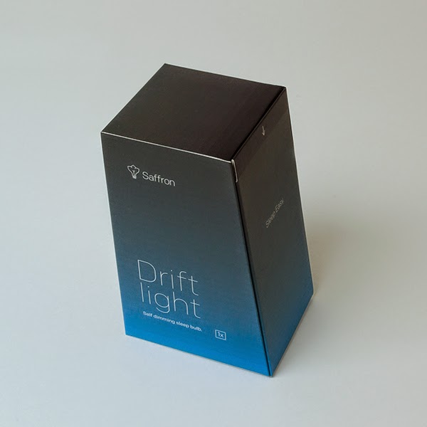
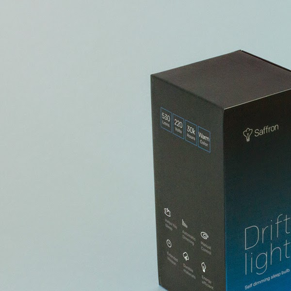
สร้างไอคอนที่กำหนดเองสำหรับหญ้าฝรั่น ตราสินค้าและบรรจุภัณฑ์ดริฟท์เพื่อแสดงคุณสมบัติของหลอดไฟ
แผงลิ้นชักอักษรแผ่ออกไปเพื่อเผยให้เห็นหลอดไฟและคำแนะนำ


คำแนะนำและคู่มือผู้ใช้อย่างรวดเร็วอยู่ในลิ้นชักของทุกแผง
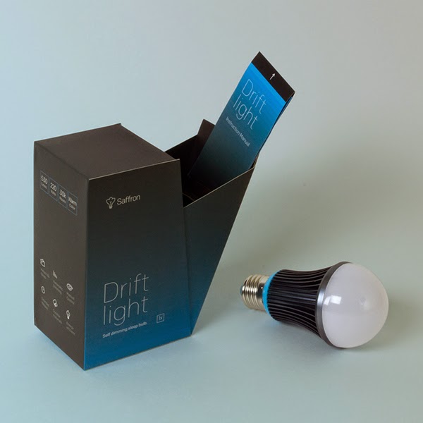
บรรจุภัณฑ์ชิ้นที่เป็นส่วนเกินถูกตัดทั้งหมดให้เหลือเพียงหนึ่งชิ้น เพื่อประหยัดต้นทุนการผลิต และสนับสนุนคุณสมบัติที่สร้างขึ้นในหลอดไฟ
ข่าวที่ 2. Pali Tea Packaging (Student Project)
ARTICLE (บทความ)
Designer : Nguyen The Bao
School : Saigon Technology University (STU), Ho Chi Minh City
Type Of Work: Student Project
Country: Vietnam
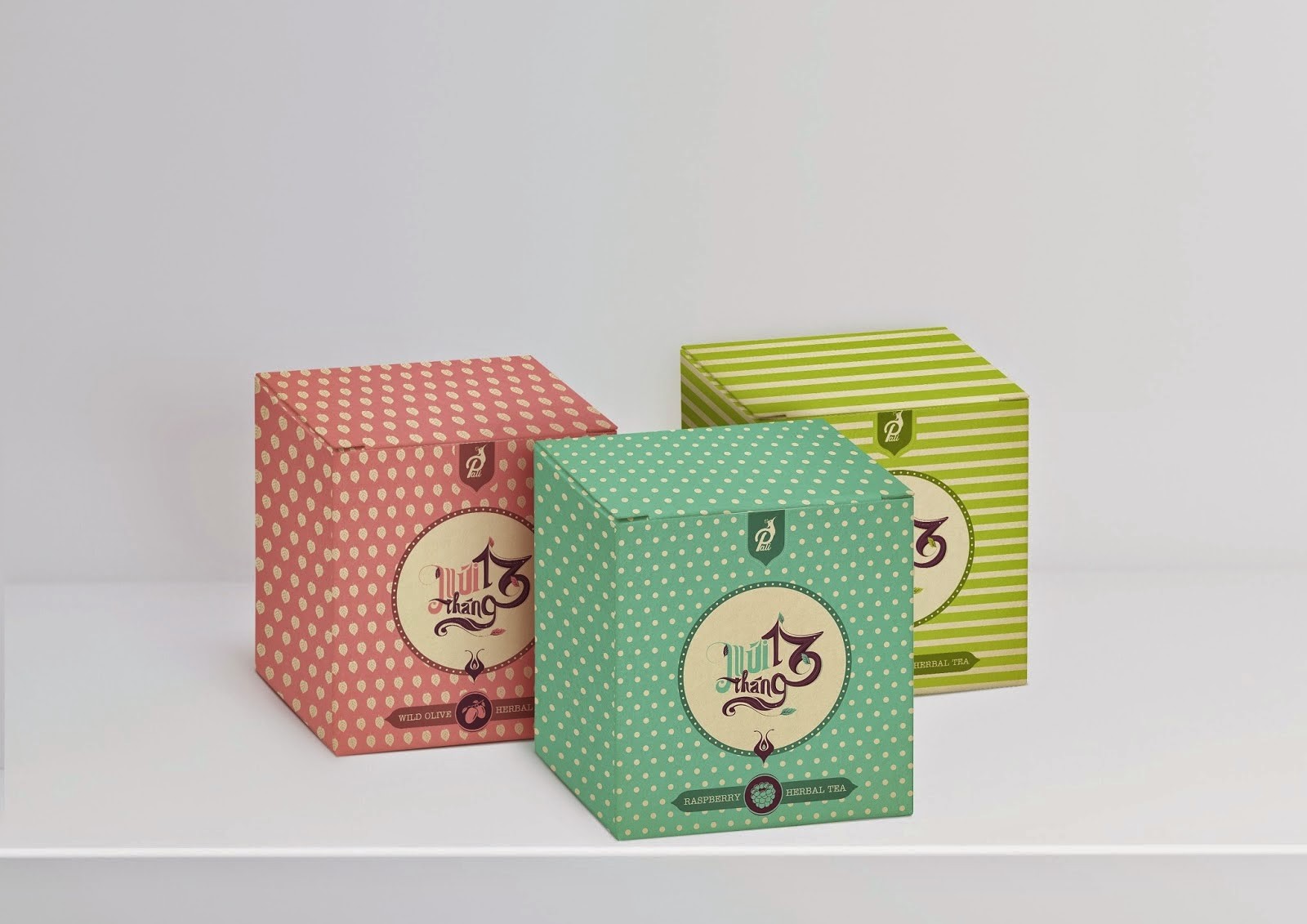
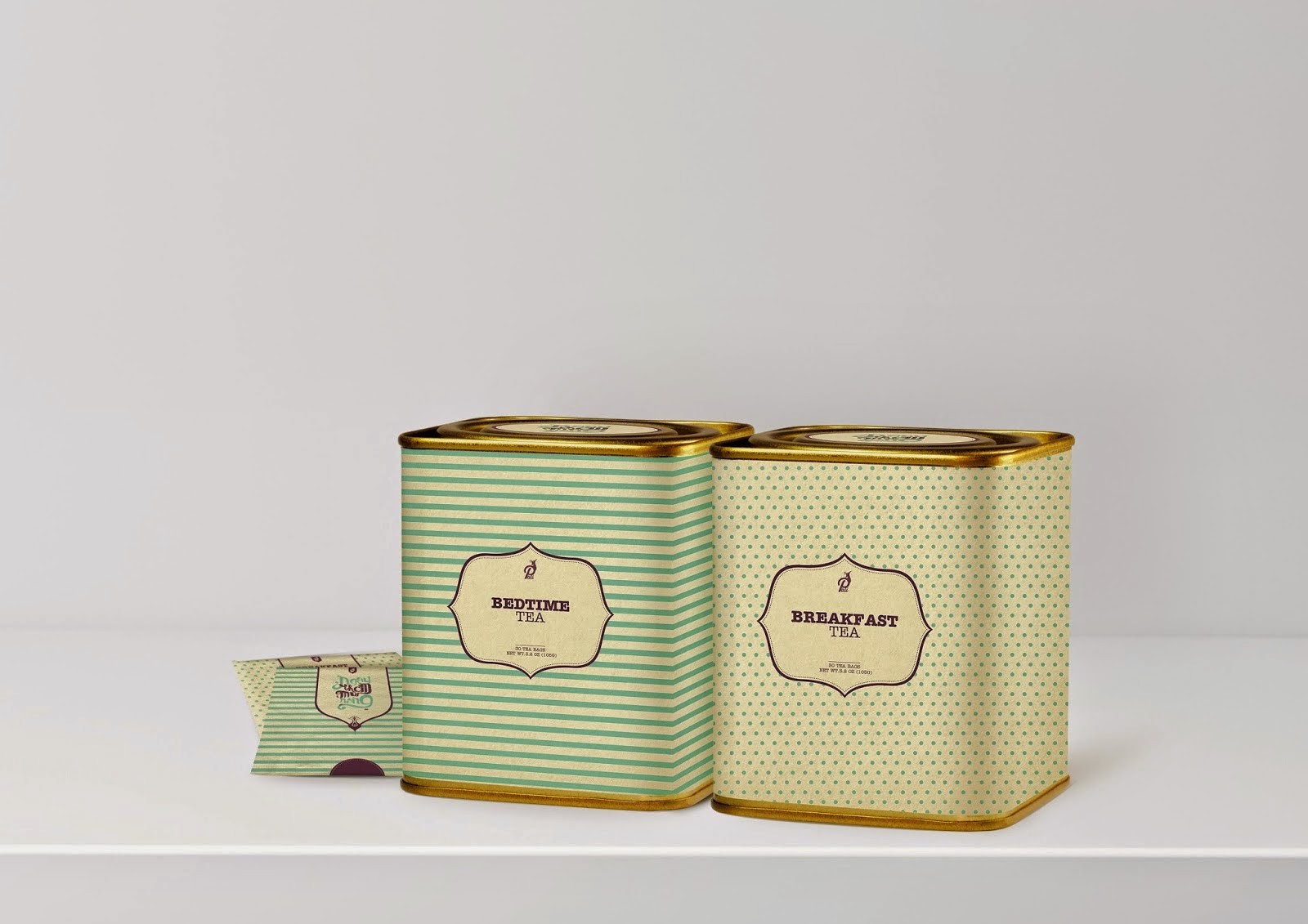
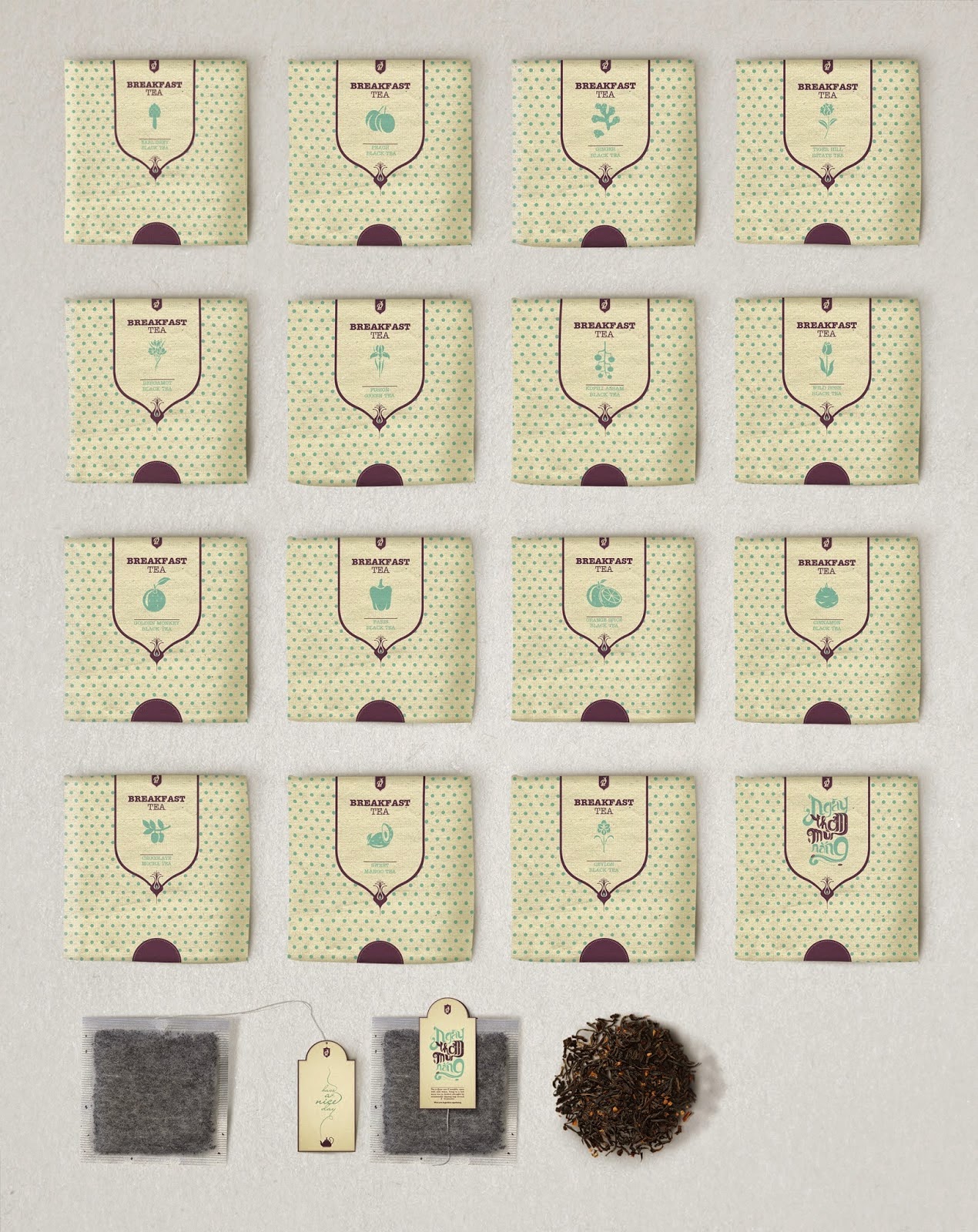
Nowadays, there's a significantly big demand in drinking tea of adults. Meanwhile, the youngers use refreshers for their daily drinks. It seems to be that they don't keep a keen eye on tea drinks. So, Pali tea brand will satisfy the youngers who forget the value of tea. These products are divided into 3 types.
SMELL OF THE 13th MONTH TEA | Mùi tháng 13
- You can use them in a month
- Material : tin & paper
SMELL OF THE SUNLIGHT TEA | Ngày thơm mùi nắng
- You can use in the morning and before you go to bed
- It has 15 flavours
- Material : tin & paper
7 DAYS FOREVER TEA | 7 ngày cho mãi mãi
- You can use them weekly
- They has 7 flavours for 7 days in a week
- Material : glass & paper
แปลข่าว
ผู้ออกแบบ : เหงียนเบ้า
สถานศึกษา : มหาวิทยาลัย เทคโนโลยีไซ่ง่อน ( สตู ) , โฮจิมินห์
ประเภทงาน : โครงการนักศึกษา
ประเทศ : เวียดนาม
ทุกวันนี้ มีมีนัยสำคัญความต้องการในการดื่มชาของผู้ใหญ่ ขณะเดียวกันวัยรุ่นใช้รีเฟรชเชอร์ดื่มทุกวันของพวกเขา มันดูเหมือนว่าพวกเขาจะไม่วางชาไว้บนเครื่องดื่มชาเพราอาจจะทำให้ชาเข้าตาแล้วแสบตาได้ ดังนั้น แบรนด์ชาภาษาบาลีจะตอบสนองกลุ่มวัยรุ่นใครลืมคุณค่าของชา ผลิตภัณฑ์เหล่านี้จะแบ่งออกเป็น 3 ประเภท
กลิ่นของชา 13 เดือน
- คุณสามารถใช้ในหนึ่งเดือน
- วัสดุ : กระป๋องกระดาษ
กลิ่นของชาที่แสงแดด
- คุณสามารถใช้ในตอนเช้าและก่อนเข้านอน
- มี 15 รสชาติ
- วัสดุ : กระป๋องกระดาษ
ชาตลอดทั้ง 7 วัน
- คุณสามารถใช้ชาได้ในรายสัปดาห์
- ชามี 7 รสชาติ สำหรับ 7 วันในหนึ่งสัปดาห์
- วัสดุ : แก้วกระดาษ

ข่าวที่ 2. Love Cats (Concept)
Love plus is a Romania brand of condoms and they ask our agency to come with more proposals for an packaging upgrade in line with their new positioning:Make love not just sex.
The main task was to come with an new concept that would appeal to women and men, playful and having an emotional touch in order to differentiate from other brands that claim safe sex.
We proposed to use cats as a symbol because of it's elegant and sexy movements.
In order to balance the girlish feeling we proposed a new logo shape inspired from viagra pill shape to offer a more masculine feeling.
The naming of the variants was change from Classic to Classic Romance, Strawberry flavour to Strawberry Kiss and from Thin to Rich Sensations in order to underline the new positioning.
We developed the individual pack, the display and a communication layout for the new pack.
แปลข่าว
บริษัทครีเอทีฟ : remark studio
ลูกค้า: PSI
สถานที่: โรมาเนีย
ประเภทโครงการ : แนวคิดLove plus เป็นยี่ห้อของถุงยางอนามัยในโรมาเนีย และพวกเขาได้ถามถึงหน่วยงานที่จะมากับข้อเสนอเพิ่มเติมสำหรับบรรจุภัณฑ์ที่ปรับปรุงเพื่อให้สอดคล้องกับตำแหน่งใหม่ของพวกเขา : ให้ความรัก ไม่ใช่แค่เพศสัมพันธ์
ภารกิจหลักคือการมาพร้อมกับแนวคิดใหม่ ที่ดึงดูดทั้งผู้หญิงและผู้ชาย ขี้เล่น และมีสัมผัสทางอารมณ์เพื่อแยกความแตกต่างจากยี่ห้ออื่นที่อ้างว่า เซ็กซ์ที่ปลอดภัย
เราเสนอให้ใช้แมวเป็นสัญลักษณ์ เพราะมันหรูหราและเซ็กซี่ด้วยการเคลื่อนไหว
เพื่อความสมดุลและความรู้สึกที่กระตุ้งกระติ้ง เราเสนอโลโก้ใหม่ที่ได้แรงบันดาลใจจากรูปร่างรูปทรง ของยาไวอากร้าเพื่อให้สึกผู้ชายได้มีความรู้สึก เพิ่มขึ้น
การตั้งชื่อตัวแปรคือ เปลี่ยนจากคลาสสิกเป็นคลาสสิกโรแมนติก , รสสตรอเบอร์รี่เป็นสตรอเบอรี่จะจูบและจาก เพื่อที่อุดมไปด้วยความรู้สึก ในการที่จะเน้น เพื่อตำแหน่งใหม่
เราได้พัฒนาชุดของแต่ละบุคคล , การแสดงและการสื่อสารรูปแบบแพ็คใหม่
.jpg)
.jpg)